helping a non profit step boldly into the future
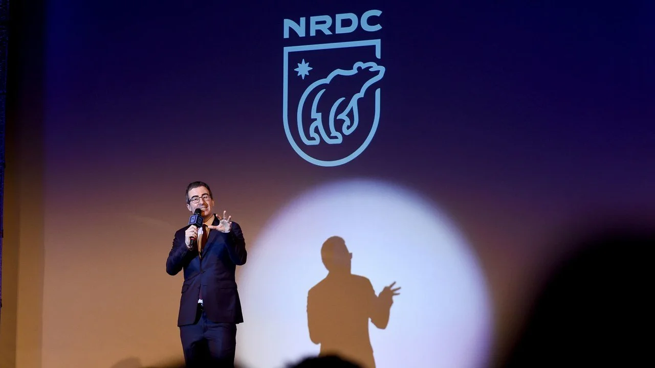
I was brought on to a newly created Communications Department at NRDC. Our initial challenge was to rebrand a "deep green" environmental group whose logo hadn’t changed since 1970. The goal was to create a modern, recognizable identity that honored their roots while showcasing confidence, authority, innovation, and their mission. I contributed to concept development, established the look and feel, redesigned their website, and created a custom wordmark and brand style guide.
In addition, we redesigned a website that had 20k pages to align with the new look and feel. I played a key role in all stages of this extensive redesign – from whiteboarding, information architecture, UX, to the final touches. Worked closely with external strategy and creative consultants, threespot and Jackson River.
Role // Art Director / Typographer
Illustrator, Designer // Ross Bruggink
Designer // Samantha Schaeffer
Creative Director // Bob Comire
Communications Director // Michelle Egan
Focus // Branding, Typeface Design, Information Architecture, UX, UI, Responsive Web Design
Recognition // Graphis, HOW Design
Features // Brand New: Bear Goes on the Offense, Brand New: The Best and Worst Identities of 2015
The Natural Resources Defense Council combines the power of more than two million members and online activists with the expertise of some 500 scientists, lawyers, and policy advocates across the globe to ensure the rights of all people to the air, the water, and the wild. www.nrdc.org
Early sketches of the bear - giving it a role of a defender and exploring how she can feel strong, active and boldly stepping into the future.
Old vs new logo


